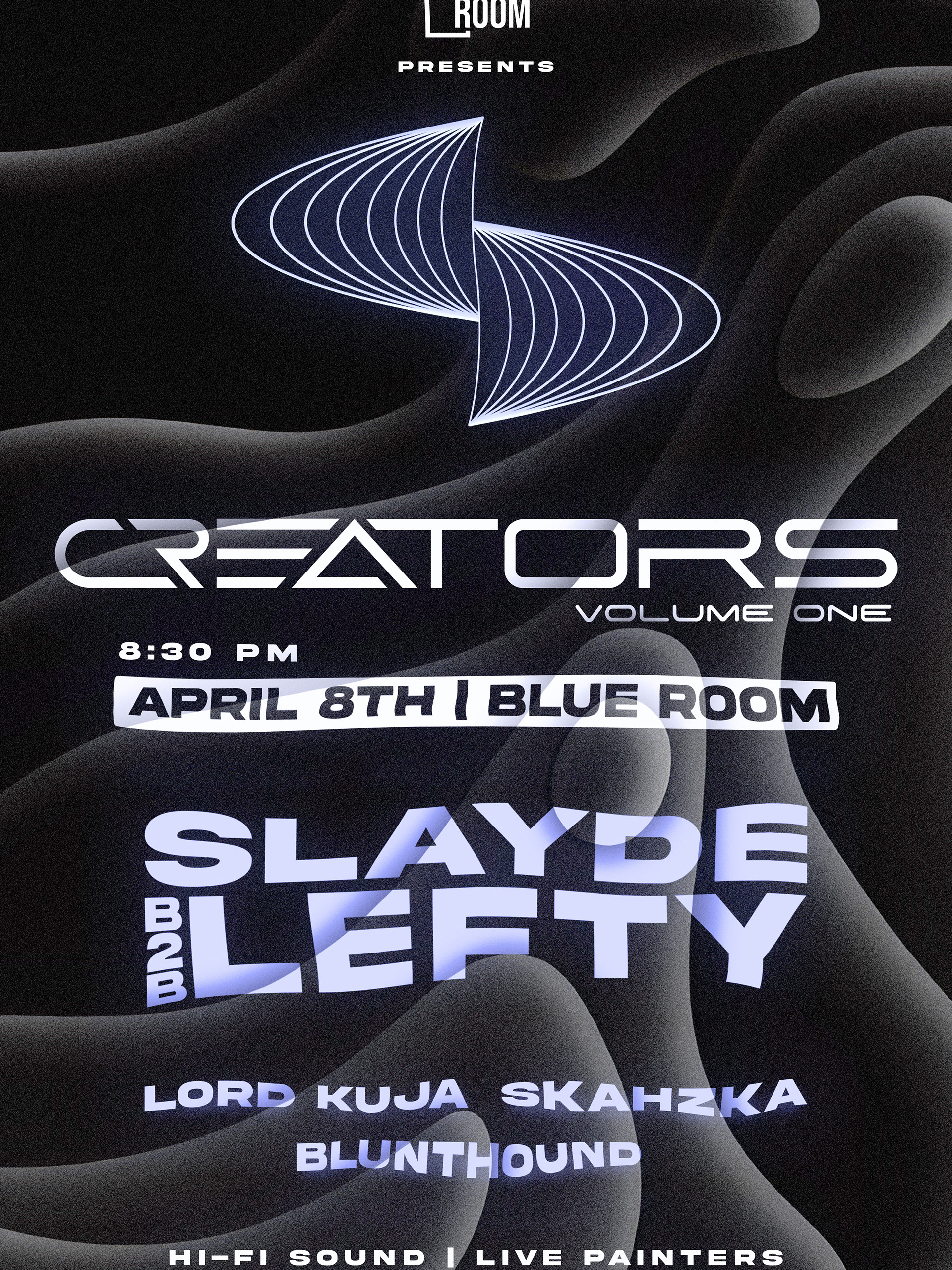
Official Poster
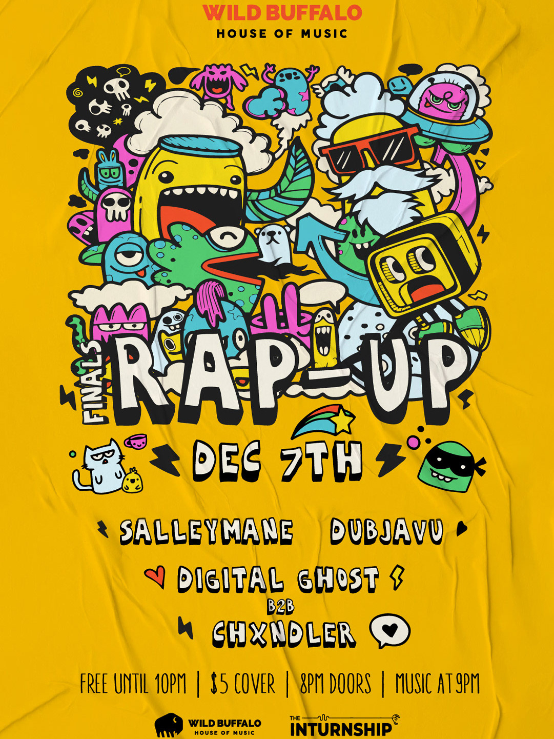
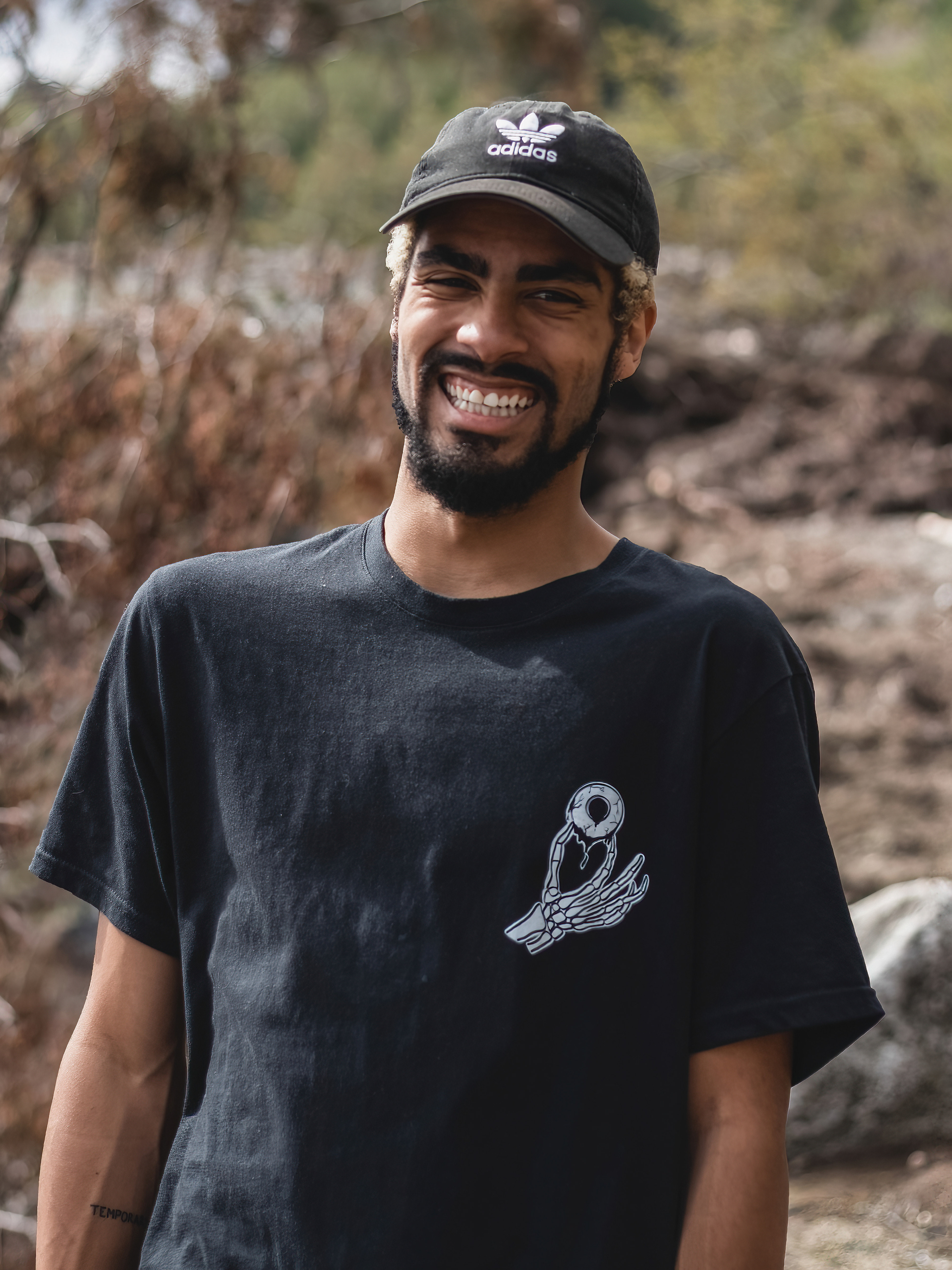
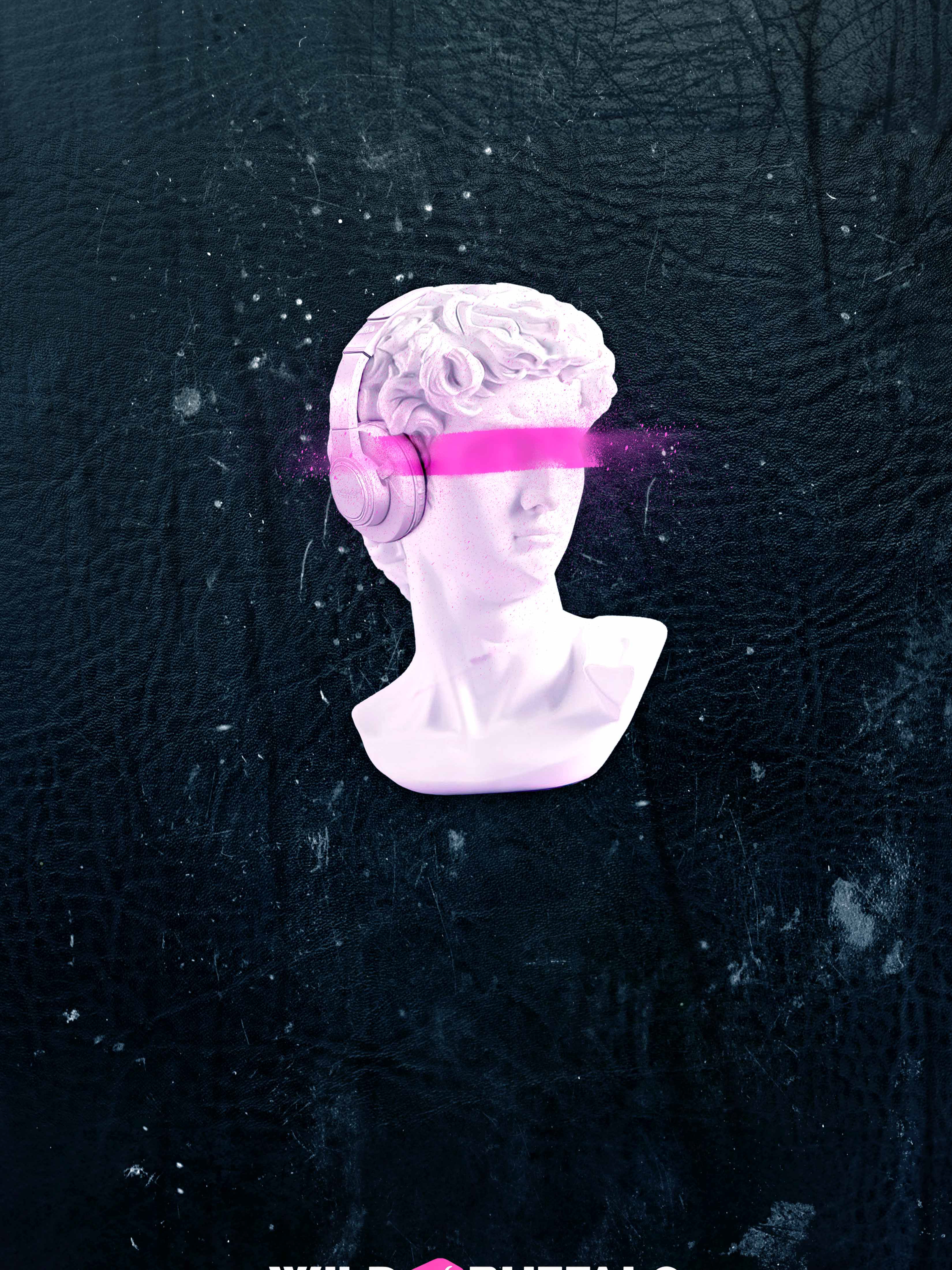
I designed this poster using original photographs of the subjects blended onto a backdrop, along with a custom typography logo for the event.
The main challenge was organizing the information clearly, which I accomplished through careful adjustments of spacing and sizing.
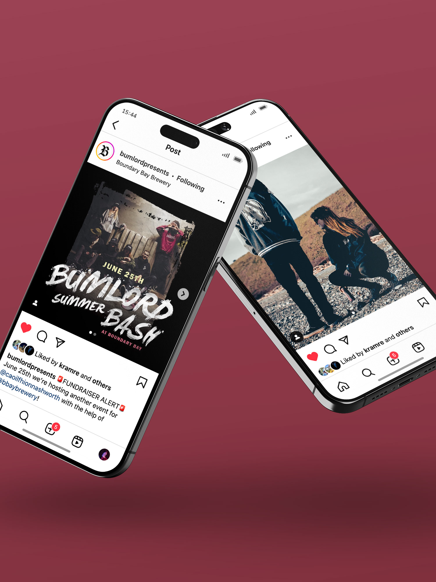
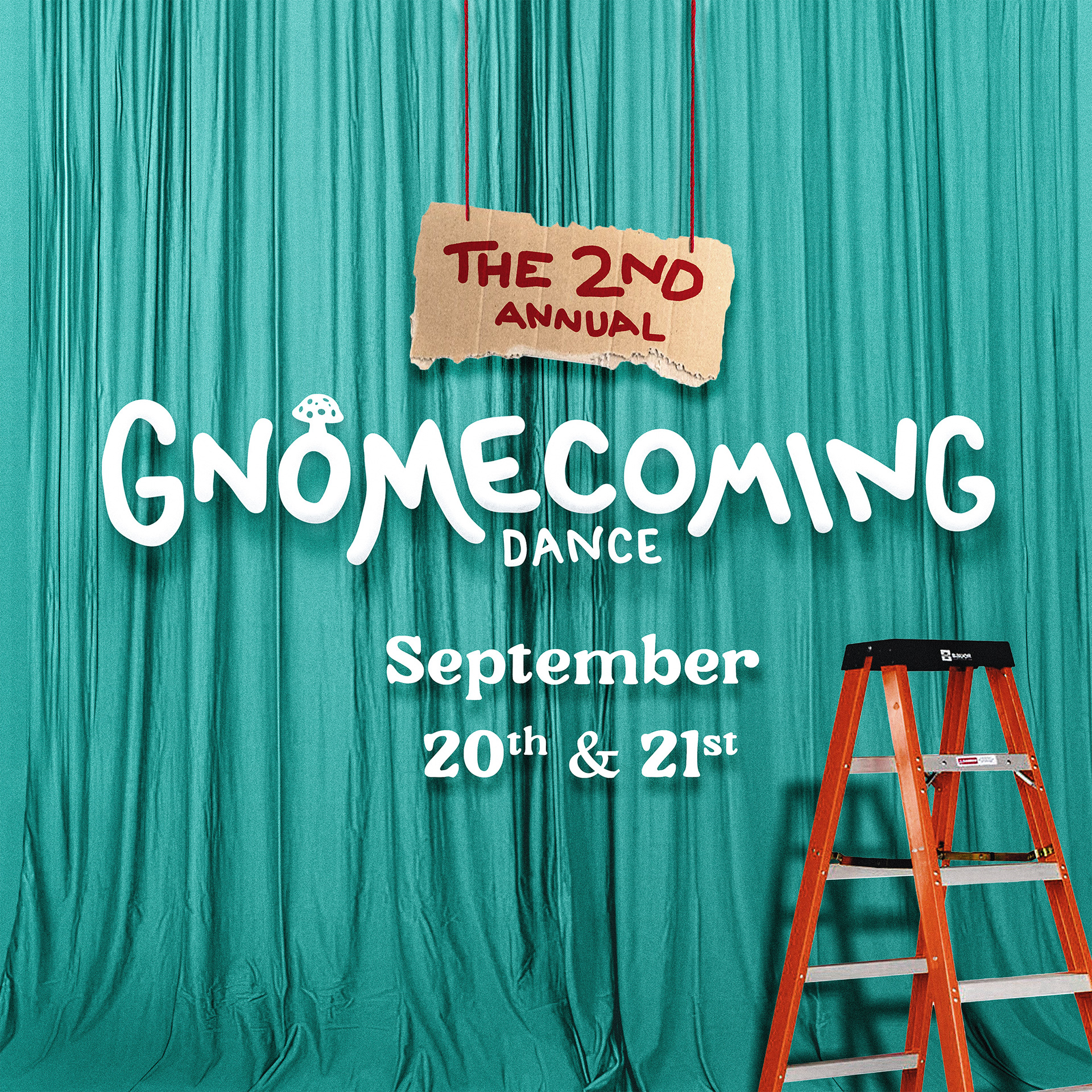
Promotional assets
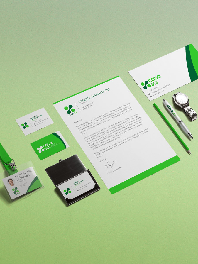
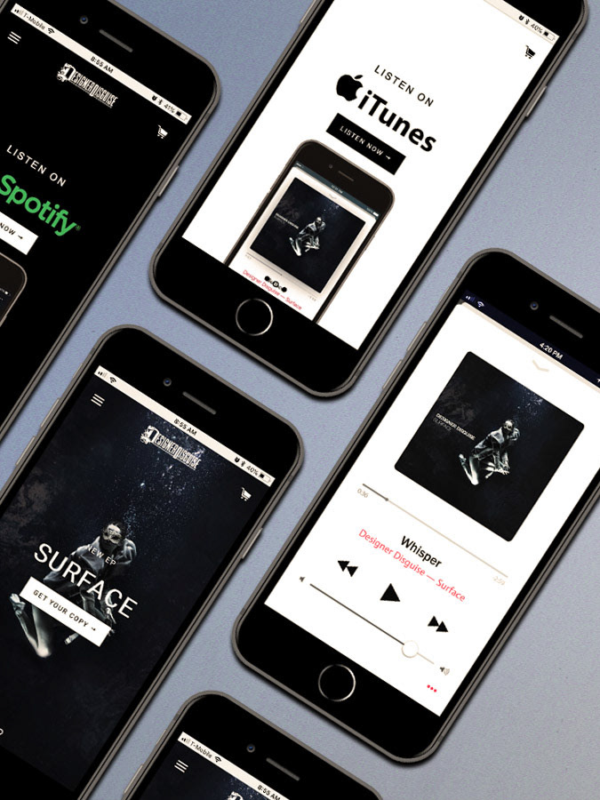
Print and digital assets were created and resized from the original posters.
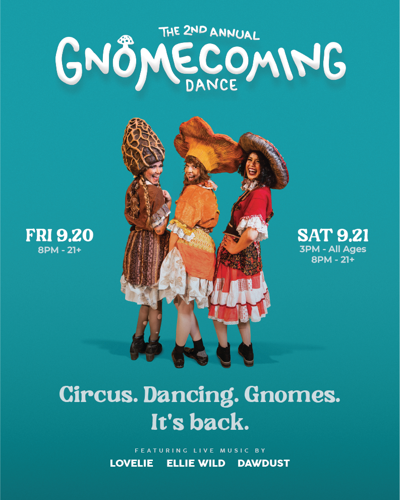
Magic of editing.
The goal of this poster is to showcase bright, colorful subjects against a monotone background, sparking curiosity.
The subjects were cut out from their studio background to appear as though they're floating over a non-realistic backdrop. Adjustments to lighting and color grading ensure natural skin tones and key elements.
They are placed in a container of negative space, allowing small event details to stand out while supporting the bold subjects in the foreground.
This design captures attention and invites further exploration. The client is very pleased with it, and it’s one of my favorite projects!
